Water & Photography

Street photography pioneer André Kertész (1894-1985) brings a poetic surrealism to everyday activities. My discussion of three photographs in which water appears in Kertész’s work is Part 2 of a series on treatments of water in art. (Part 1 here)

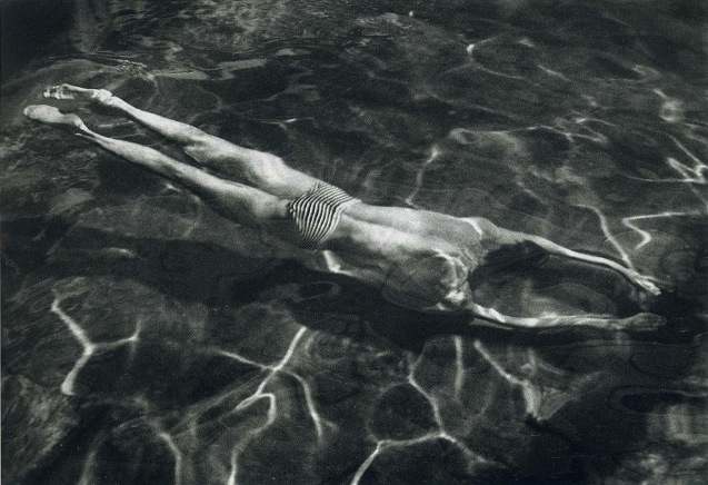
André Kertész. Underwater Swimmer, Hungary, 1917

The Underwater Swimmer shows water as a source of recreation. It is integral to good health, self-renewal, an image of rebirth. We are not shown the edges or confines of the pool: it is a microcosm, a mini-universe. The man adapts so perfectly to these conditions that he seems almost amphibious. The water both reflects light and is a medium through which light travels. Both of these properties elicit a sense of wonder and surprise in the viewer and add to the magic quality of the image. The water produces playful patterns, while the thrown shadow makes the figure appear to soar above the bottom of the pool.

André Kertész. Homing Ship, Central Park, 1944

Moving from Budapest to New York via Paris, Kertész, a Jewish refugee, turned his back on the horrors of the Second World War, though the image of a sailboat on the run does hint at his own precarious immigrant status at this time. A puddle in a city street or cobbled square produces momentary mirror-like effects of a fantastic upside-down world through which characters pass as in a dream. Part of this dream quality comes from the fact that the characters themselves are unaware of how dream-like their world is. The boat that runs away from a vanishing pool of water seems to affirm reality is stranger than fiction.

Kertész  had trouble selling photographs in America. Editors told him his compositions were too complex, often with the key action of the picture happening in the distance rather than in the foreground. (Pierre Borhan, André Kertész: His Life and Work, 1994, pp. 24-28) But this deep-focused multi-planed world is precisely what makes the images so charming and so charged with irony, as one character is oblivious to a telling aspect–the signs and symbols–of the city around them.

It is highly characteristic of Kertész that he uses a puddle as his source of water imagery. What could be more transitory, more humble, more ignored, even scorned than a puddle in the street! Yet these fortuitous pools help the photographer transform an ordinary street scene into a scene from a dream.

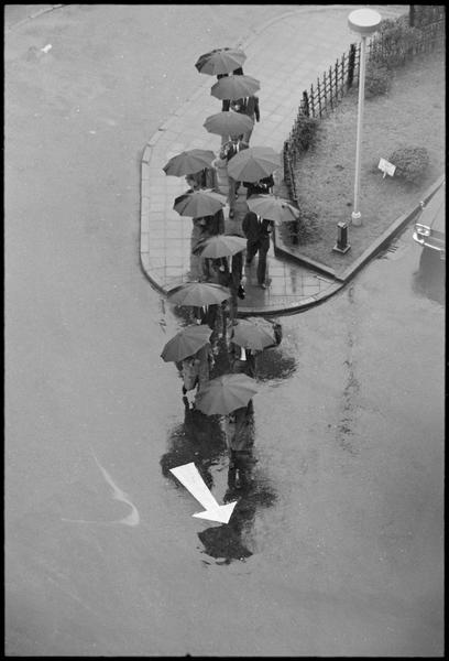
André Kertész. Rainy Day, Tokyo, 1968

In this hillside parade of teetering umbrellas, Kertész uses a high angle view to create a humorous effect. The pedestrians, diminutive and anonymous underneath their bulky shields, appear to be corralled and herded by the signs and signals of the urban environment. Water is an important part of this environment. Though invisible in the photo, water conditions this absurd behaviour. Kertész encourages us to laugh at ourselves, but there is no shame or superiority in this laughter. Rather there is a sense of empathy and understanding, delight and transformation.

Kertész skillfully exploits the properties of water–luminance, reflectivity, mutability, invisibility–to add poetry to mundane situations. In his image of the swimmer, he shows water as a source of health and renewal. In his picture of the sailboat on the run, he shows water as a transient and vanishing substance whose presence should not be taken for granted. In the picture of the umbrellas following an arrow, he shows water as an invisible part of life to which we make necessary adaptations. In all, water is an important element of this photographic dream diary of the 20th century played out on the streets of its greatest cities.


Posted in Uncategorized | Tagged

The Young Man and the Sea

Water and ocean appear frequently in the art of Robert Pope. They reflect his need to connect images with a sense of place, his native Nova Scotia, a peninsula surrounded by the North Atlantic. The artist presents his environment as an ever-changing water-world, open to voyages of the imagination. This blog looks at different uses of this water imagery, and how these changes affect the meaning we read into them.

Robert Pope. Study for Harbour, 1985.

In 1985, Robert developed an image called Harbour. A couple seen from above view a dazzling array of irregular shapes and foamy swirls in moving water. The hypnotic patterns invite a state of reverie, reflection and daydream.  Robert wrote in an artist’s statement from this time: “I believe we take aspects of our physical environment as metaphors for our experience. Our lives are directly affected by the economic and environmental benefits of the sea. We are drawn to its beauty and danger. Its ancient rhythms reflect our notions of life and eternity.”


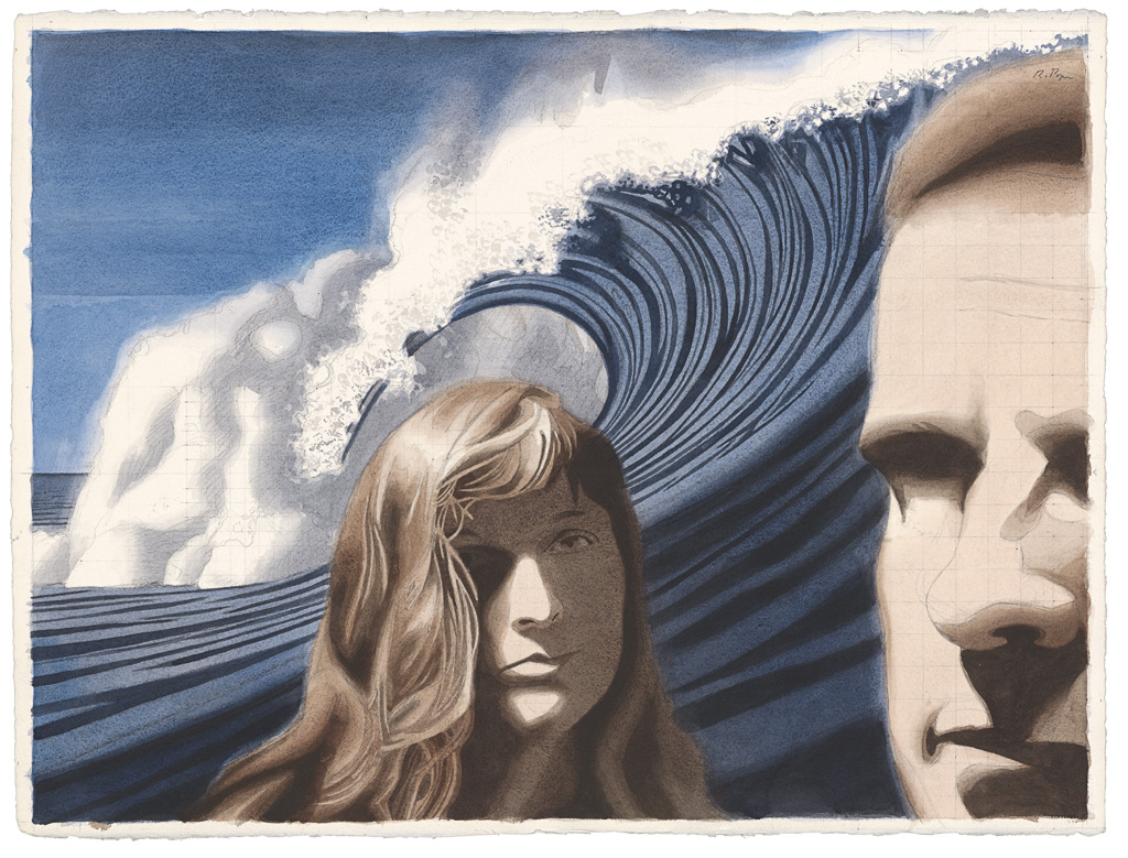
Robert Pope. Surf, 1988

In his painting, Surf, an enormous wave crashes between a couple. The water voices their sense of  exhilaration, passion, annihilation. The painting is from a series based on Elizabeth Smart’s experimental novel, By Grand Central Station I Sat Down and Wept. Here is a sample quotation: “But I have become part of the earth: I am one of its waves flooding and leaping. I am the same tune now as the trees, hummingbirds, sky, fruits, vegetables in rows. I am all or any of these. I can metamorphose at will.” (p. 43)

In this context, the word “metamorphosis” indicates the transformative power of love, both in its positive inspirational aspects and its obsessive, self-destructive aspects. The painting uses water as a symbol of this transformation. The crashing wave also alludes to Hokusai, the great Japanese artist (1760-1849) who worked in the genre known as ukiyo-e. Ukiyo-e translates as “pictures from the floating world,” meaning the in-between world, the not-quite respectable world of pleasure, travel and adventure opening up to the newly prosperous middle class. In Hokusai’s most famous image, The Great Wave off Kanagawa, Hokusai contrasts the violent and transitory effects of water with the calm permanence of the distant Mt. Fuji. Robert looked for similar contrasts in his own work, but with more of a focus on human psychology.

Robert Pope. Metamorphosis, 1986

Robert Pope. Sketchbook studies for Metamorphosis, 1988

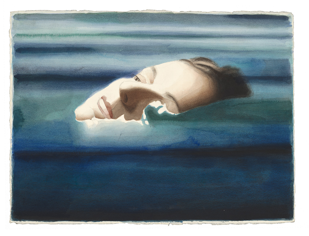
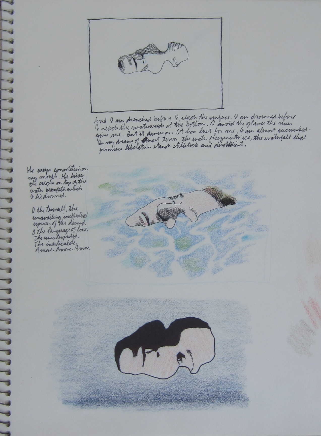
In the studies at right for the painting Metamorphosis, the water’s abstract patterns turn a woman’s face into a jigsaw puzzle–a woman drowning in love. Smart writes how she “craves violence for expression, but can find none. There is no end. The drowning never ceases. The water submerges and blends, but I am not dead. O I am not dead. I am under the sea. The entire sea is on top of me.” (Elizabeth Smart, p. 118-119) The mood becomes darker here, though Robert’s image suggests birth as well as death. The water functions almost as a mask. Through psychological projection, the water becomes symbolic of a state of mind, the unconscious and its powerful effects on human character.


Robert Pope. Patient Daydreaming, 1986

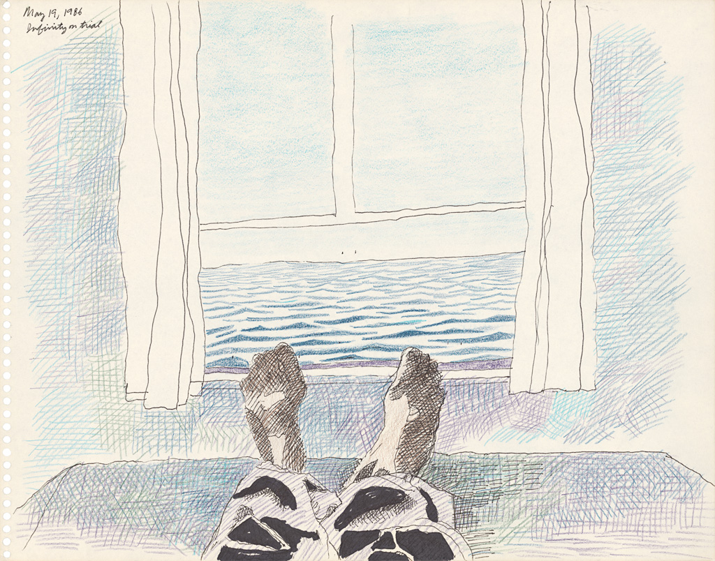
Robert was being treated for cancer at this time. (He died in 1992 of the side effects of the treatment for Hodgkin’s Disease.) Above is a sketchbook drawing done from his hospital room in Princess Margaret’s Hospital in Toronto. He is dreaming of escape to another place, turning his confined room into the cabin of a fantastic ocean voyage.

Robert Pope. Intravenous Solution and Ocean, 1991


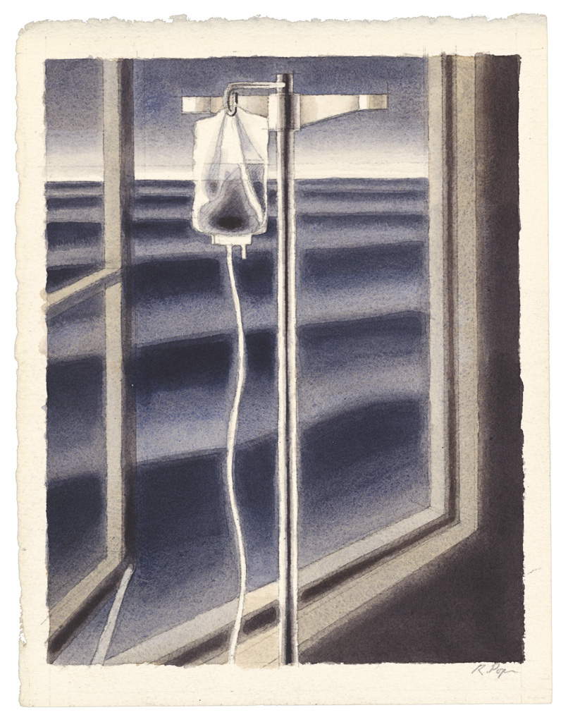
In Robert’s subsequent series “Illness and Healing,” the ocean landscape gives way to a hospital landscape filled with busy doctors, staff, technicians, patients and visiting family. Yet water imagery reappears in one key image. An I-V pole stands before a window, with the ocean visible beyond. The painting contrasts interior with exterior, contrasts vertical pole with horizontal waves, contrasts medical instrument (science) with nature, contrasts the liquid in the solution bag (feeding into the patient’s bloodstream) with the limitless waters beyond.

In a sketchbook Robert copied the passage: “God come down out of the eucalyptus tree outside my window, and tell me who will drown in so much blood.” (Elizabeth Smart, p. 35) Underneath, Robert noted: “Blood is a simultaneous symbol of birth, life and death. Water operates the same way, a life-giving substance that one can drown in.” The picture Intravenous Solution and Ocean shows no patient, but indicates a dream-like interior where an awkward instrument provides an artificial life-line. The image suggests end of life, which mysteriously may not be the end. The water encourages the viewer to think of infinity, continuity, cosmic forces transcending the limits of our perspective of individual being.

Water appears in different ways in the art of Robert Pope. Water provides a sense of place. Water is playful, transformative, unpredictable and dangerous. Water is composed of patterns that are hypnotic and graphically compelling. Water assists the psychological projection of mental states. Water serves as a kind of mediation of unspeakable feelings between two figures. Water evokes a dream of escape, an invitation to daydream and imagination. Water suggests new perspectives on our fixed notions of time and being. These new perspectives have religious overtones, as well as being a statement of creative possibilities for artist and viewer.


Posted in Uncategorized | Tagged

Poesia: Art, Love & Inspiration


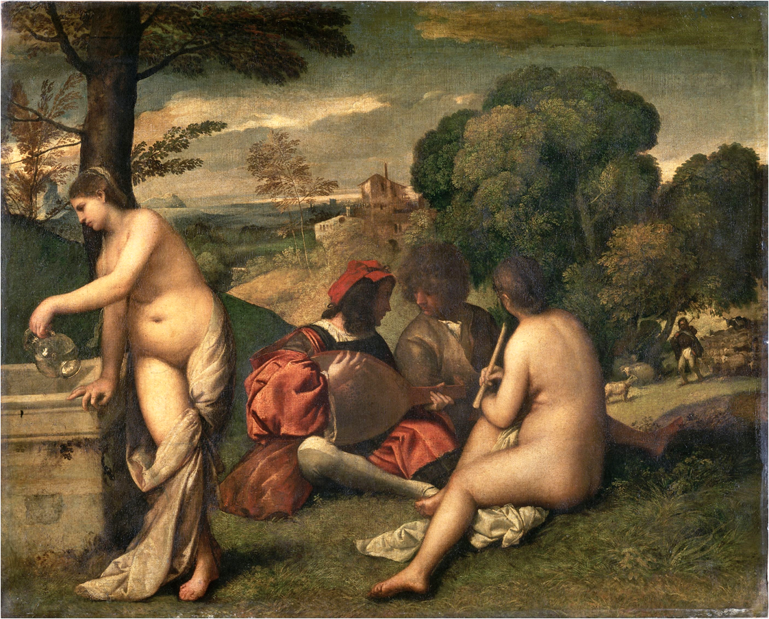
The figures are half submerged in shadows. The landscape features lush trees, a distant shepherd and flock, a water fountain, a luxuriously clad musician and friend and two naked goddesses (who may or may not be visible to the self-absorbed gentlemen). It is a tantalizing picture of love, music, nature and inspiration. This poetic painting, so moody and mysterious, suggests mythology without illustrating a specific story.

Giorgione, Fête Champêtre, 1509-1510

Nature imagery and love poem combine in Renaissance art in an “enigmatic pastoral” genre often referred to as poesia. This blog looks at two more recent examples of poesia to demonstrate the adaptability of this remarkable genre.

In modern times, the painters Manet and Munch revolutionize the lyrical mood of these pastoral images by introducing troubling contemporary elements, suggesting strongly the need for love, but implying that love is imperfect or imperfectly fulfilled.

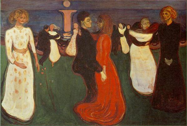
Edvard Munch. Dance of Life, 1900

In the image above, Munch’s dancers move from the youth on the left to the lonely widow on the right in a symbolic cycle of life. The moonlit landscape, a meadow that overlooks a beach, casts an eerie spell on the figures who move as if in a trance through their allotted roles. Munch turns poesia into an allegory, where love is seen as a kind of obligatory social expectation and those who fall outside the norm of it find themselves unhappily cast out.

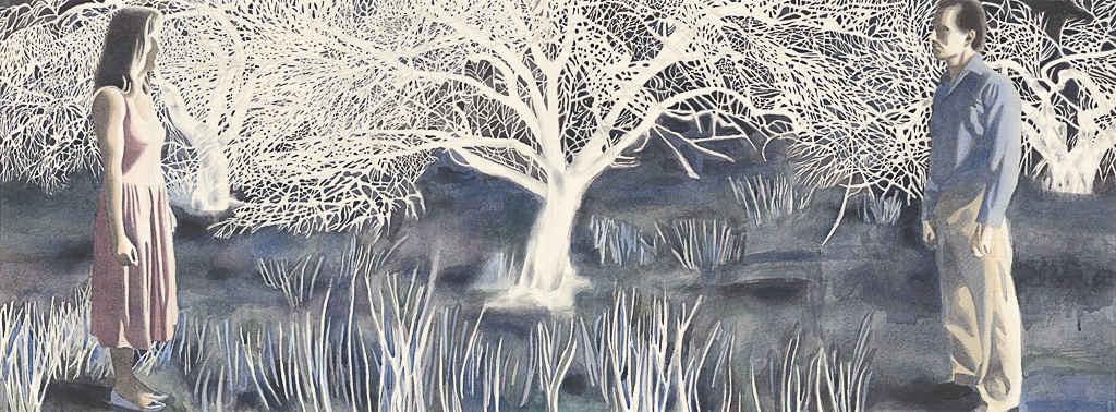
Robert Pope. Orchard, 1987.

The Canadian artist Robert Pope (1956-1992) added his own take on this ever-changing genre. The above image shows a landscape that both separates and connects figures who stand as if awaiting the signal for a duel. The artist turns natural elements like the apple tree into a mandala-like signifier that must mediate the unspeakable feelings of his spellbound lovers. The landscape is charged with energy and significance, but the meaning is ambiguous. Like the Giorgione, the image is moody and mysterious. Like Munch, the image of love unfolding suggests both anxiety and compulsion.

In Orchard, there is a mythic allusion to Adam and Eve and the forbidden tree of knowledge. Like other peosia images, Robert’s Orchard departs from the mythic source to tell its own story. Robert was inspired by Elizabeth Smart’s novel By Grand Central Station I Sat Down and Wept (1945), the story of an unhappy love affair between a poet and a married novelist. The figures in the painting are poets, much as the figures in the Giorgione’s poesia are musicians. By creating a series about poets who break a taboo by falling in love, Robert returns to Giorgione’s theme of artistic inspiration, but complicates it by suggesting that the practitioners of art, poetry and love enter a dreamscape that is dangerous and possibly forbidden.

The Garden of Eden is ultimately a story of acquiring knowledge and self-awareness, a knowledge that makes people human, but also separates them from nature. This separation is symbolized by the expulsion from the garden. Poets and artists see the world differently. Instead of accepting exile and taking pride in our separation from nature, poets dare to dream of reuniting with nature, of re-entering the garden. Robert’s Orchard suggests that the landscape, so central to the poesia genre, may not symbolize an idyllic safe-haven for poetic inspiration, but rather a kind embattled almost unrecognized zone to sneak into at night at the user’s peril.

Poesia is a genre still vibrantly alive in contemporary art. The license these poetic images take with mythology allow them a flexibility to adapt to new circumstances and changing attitudes. At its best, the genre is mysterious and paradoxical, exploring both social and rebellious elements in processes of love, art and creativity.

A retrospective of Robert Pope’s work is currently on view at the Art Gallery of Nova Scotia in Halifax and will be on view until December 9, 2012. More info on Pope’s work and his legacy can be found at the Robert Pope Foundation website.


Posted in Uncategorized | Tagged

Paperback Art

Romance, surrender, rescue. The girl in the boy’s arms. The girl in the robot’s arms or the monster’s fist. Screaming, swooning, terror, ecstasy. The very stuff of movies, harlequin novels, trashy drama. Guilty pleasures.

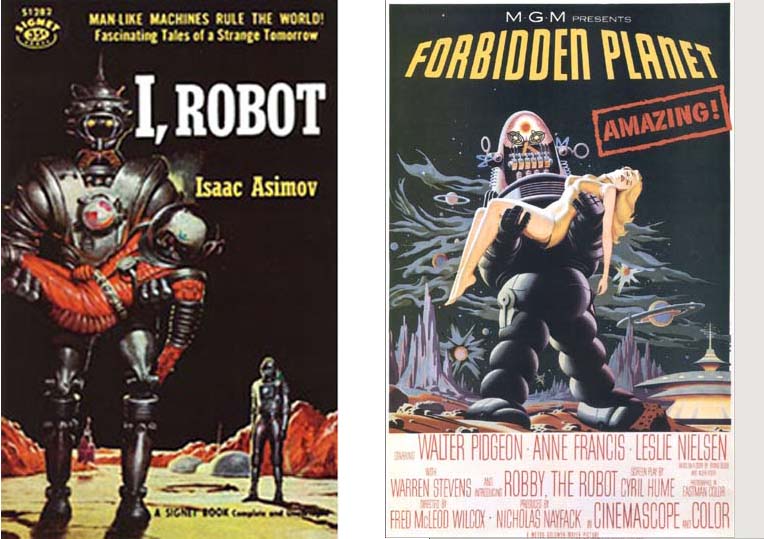
Book cover, 1950 and Movie Poster, 1956

Book cover, 1950 and Movie Poster, 1956

Why is the Asimov cover image (seen above) uninspiring, whereas The Forbidden Planet poster is fun, saucy and weird? The tilted perspective, the grinning face, the bathing beauty–is she an astronaut or an extra from a Tarzan movie who walked onto the wrong set? No pretence at realism here. Enter loveable Robbie the Robot, stick in a Chinese pagoda, fainting women, Grand Canyon rock forms, and it is, as advertised, amazing. The movie sadly does not live up–how could it?

Cover art: E. Gorinstein

Compare this delightful cover illustration by E. Gorinstein from the 2002 J’ai Lu edition of Les robots (I added the English title pun). Here we see robot not as alien monster but rather robot as funky car. Its eyes serve as headlights, antenna as steering wheel/ gear shift, chin plate as pedal. The astronaut looks bored for a space cowboy, which adds to the humour. This is not an astonishing adventure but something he does every day. Like operating a backhoe. The purple Ziggy Stardust spacesuit adds a note of style. The illustration depicts one of the early stories in Asimov’s vision of human-robotic symbiosis and delightfully conveys Isaac Asimov’s humour of robot psychology.

Expedition_to_earth.BallantineEdition 1953, Cover Art Richard Powers


Illustrator Richard Powers

The most versatile and experimental of science fiction illustrators. A complete illustrated list of his book covers can be found on the invaluable site, Internet Speculative Fiction Database. Early work owes a debt to surrealism. Later work makes use of paint splatter and collage. This 1953 cover illustrates Clarke’s story The Sentinal, the starting point for the film 2001: A Space Odyssey. A monolith, depicted as an irregular undulating pyramid, is shown on the surface of the moon with the Earth in the distance beyond. The monolith raises the question: is it a natural form or a manufactured object? An ant-sized human figure throwing a giant shadow appears on the horizon under a hovering blimp-like eye.


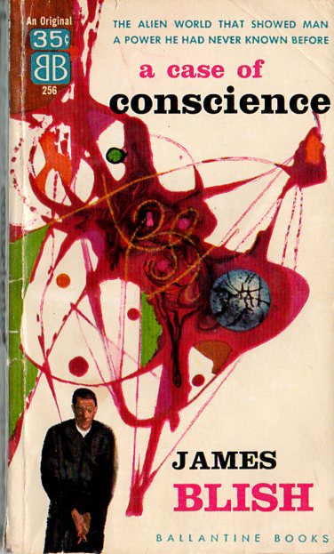
Case of Conscience, 1958. Cover Art by Richard Powers

Starship Troopers, 1959. Cover art Paul Lehr

Here is another cover by Richard Powers. In the story, missionaries and scientists establish a colony on a remote planet with few natural resources valuable to humans, except for a substance used in the making of nuclear bombs. The colonists debate whether they should reveal the truth to other humans or suppress it.

Abstract expressionism, atomic structures in a novel obsessed with Cold War posturing. Both an anthropological approach to SF, and a religious fable, James Blish’s A Case of Conscience is cited by Orson Scott Card as a strong influence for his novel Speaker for the Dead. 


Cover art Paul Lehr

The insect-like space craft with its dark cavernous shadow, monumental in scale next to the uneven line of waiting figures, produces a bizarre effect, as in the paintings of Hieronymous Bosch. We ask what is it, in this confrontation with the unknown. The green sky with blue clouds suggests an alien atmosphere. The yellow fire on the horizon is all that distinguishes sky from ground. The luminance of the wash, the hard sheen of metal, the contrast of scale, all give this design a graphic punch that matches the drive and gusto of Heinlein’s writing.

Cover Art by Bob Pepper


Illustrator Bob Pepper

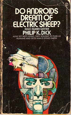
Just how do you illustrate a Philip K. Dick novel anyway? Using a Pop Art approach, as in this illustration by Bob Pepper, is not a bad idea. Pop Art is linked to the mass consumption of a consumer society. Pop Art is often produced using similar methods of mass reproduction like Andy Warhol’s silkscreen prints. Other artists mix Pop icons with Op Art, using bright colours, bold semi-abstract patterns suggesting psychedelic material or attitudes of mind, as well as an ecclectic sensibility that is as open to comic books as it is to Eastern mysticism. In this illustration, Pepper shows the mask-like features of a face barely covering a skeleton and robotic gears, from which seem to pour a parade of clone-like sheep. It immediately makes one think: does a robot have a mind and if so how human is that mind? What exactly are we looking at here? Man or machine? This is the very ambiguity that underlines Dick’s novel.

Album Cover Art by Bob Pepper

Remember a time when people got pleasure just looking at an album cover? More on artist Bob Pepper can be found here.

Popular movies, books and art share ideas and strategies for conveying other worlds. Experiments with visual styles, such as surrealism and Pop Art, unite books of the future with the period in which they were created. The references to Fine Art push a once-marginal genre to new levels of respectability. Pulp art is fun, pushing proprieties of tastefulness. Modern art is innovative, pushing boundaries of aesthetic experience. Science fiction cover art draws on both, adopting visually daring designs to match the unconventional ideas found inside the covers.

Cover art: Richard Powers

Women Reinvent Science Fiction

A woman gave birth to Frankenstein and his monster, opening the door for a new imaginative literature. Strangely, this literature, dealing with the future, with alternate worlds, with technology and its societal effects, became an exclusive all-men’s club. All this began to change with the emergence of a group of brilliant novelists in the late 1960s and early 70s: Ursula K. LeGuin, Doris Lessing, Kate Wilhelm, Marge Piercy and Margaret Atwood, to name only a few. This blog contrasts Marge Piercy’s Woman on the Edge of Time, 1977, with Margaret Atwood’s The Handmaid’s Tale, 1985 and discusses their contribution to the genre of SF.

Woman on the Edge

Marge Piercy. Woman on the Edge of Time, 1976. Summary: Consuelo (Connie) Ramos is placed in a mental hospital after trying to intervene in a violent family dispute. No one believes her side of the story because she is a poor Chicano woman. While in hospital, Connie begins communicating with a person from the future, Luciente, who asks her for her help. Connie answers that she is a person without power, mislabeled as insane, with no resources and no prospects. Why was she chosen? Connie is told that she has a receptive mind and that she is the only one the future people were able to make contact with. Connie is given a tour of a Utopian future world, but it is a fragile world, only attained if it is fought for by the people of the present.

Marge Piercy


In a perceptive review, Michelle Erica Green notes: “Woman on the Edge of Time is an angry text. The utopian yearning cannot disguise its rage … Yet the prose, in both the science fiction segments and the fatalistic present, has the compelling flow of poetry, and the bluntness of Connie’s self-expression keeps her grounded even when she questions her own sanity. Like her main character, Piercy labels the effort to transform the world a war. Known for her radical political activism in the 1960s — particularly for her involvement with groups which advocated armed struggle — Piercy favors violent insurgence in many of her poems and novels. Yet she chooses writing, not violence, as her means of insurrection. Connie’s violence may not be able to safeguard the future, but Piercy’s unshrinking commitment to finding radical solutions to age-old problems itself offers hope for the strength of the human spirit.”

A few things that impressed me about this novel:

Piercy contrasts a brutal, gritty depiction of poverty and prejudice in present-time America with the communal-minded future utopia. Class, gender and race merge together as issues crucial to SF and any imagined future community. What makes the story so effective is the likeable but unheroic character of Connie. She has no superpowers apart from her channeling ability and struggles throughout the story to try to understand how one without power can–and must–resist those who oppress her. She is told: “There’s always a thing you can deny an oppressor, if only your allegiance. Your belief. Your co-opting. Often even with vastly unequal power, you can find or force an opening to fight back. In your time many without power found ways to fight. Till that became a power.” (p. 317) The reader reacts to this awakening conscience with a considerable degree of ambiguity: is the heroine suffering from madness or does she have a kind of visionary revelation? This ambiguity breathes new life into the theme of medical experiments and forceful confinement, making for considerable suspense while deepening the sense of a problem that must be answered.

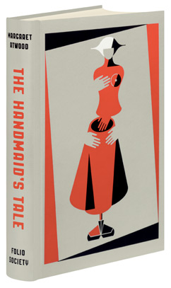
The Handmaid's Tale, 1985

Margaret Atwood. The Handmaid’s Tale, 1985. Summary: A diary-like account by an enslaved surrogate mother detailing the regime of a newly-installed totalitarian state, a theocracy in which women have no freedom and no voice. The handmaids wear awkward burqa-like uniforms that hide their figures and restrict their vision. It is a familiar story of a fundamentalist religious society that banishes love, told from a woman’s point-of-view. Most characters are so demoralized that they submissively accept their fates. The heroine, Offred, named as the possession of the Commander who she sexually serves, is plagued by memories of a former time spent with her husband, daughter and lively friends, none of whom she can now locate or account for.  The commander takes advantage of his privileged position to indulge person whims and attempts to turn his slave into his mistress, with unsatisfactory results. Out of a desperate need for some genuine human contact, Offred has a clandestine love affair with another servant. She does not know if she can trust this lover and lives in fear that she will be betrayed at any moment.

Margaret Atwood

Atwood shows how quickly a society can form which removes basic rights and privileges from women. It starts when women are not allowed to hold jobs or to own property or to access bank accounts. In this way, women become economically dependent on men. Loss of economic power, loss of autonomy.

The women who are breeders are treated like cattle, prisoners–this does not sound terribly original. What is original is that their prison guards, their disciplinarians, are other women–the oppressive and hateful aunts. On a day-to-day basis, it is women who most diligently enforce inequality and loss of self-respect, loss of personhood. Women who buy into and safeguard the system of oppression against women are one of the most serious problems posed by the novel. As for the men in the novel, they get their own special treatment as rapists, power-mongers, zealots and religious hypocrites. The oppression of women is all performed in the name of religion. This hardly seems like SF, more of a commentary on Christian fundamentalism and Islamic extremism.

The heroine does not believe in the system she is forced to live under, but she doesn’t know how to act against it. A turning point for her comes when she meets a once-fierce rebellious friend who seems to have given up. “‘Moira,’ I say. ‘You don’t mean that.’ She is frightening me now, because what I hear in her voice is indifference, a lack of volition. Have they really done it to her then, taken away something–what?–that used to be so central to her? But how can I expect her to go on, with my idea of her courage, live it through, act it out, when I myself do not? I don’t want her to be like me. Give in, go along, save her skin. That is what it comes down to. I want gallantry from her, swashbuckling, heroism, single-handed combat. Something I lack.” (p. 261) Denied this vicarious resistance, Atwood’s heroine finally attains the courage–or despair–the feeling of nothing to lose–to throw caution to the wind, setting in course a chain of events that transforms her life.

Both Atwood and Piercy are outspoken poets who write novels in many genres, including science-fiction. The works discussed above could be described as feminist or political SF novels. In her depiction of the future, Piercy addresses the problem of over-population, harmful attitudes toward environment and technology. Atwood is concerned with the breakdown of democracy, the erosion of basic human rights and the exploitation of women.

Both novels are concerned with the non-chalance with which we judge and mistreat others different from ourselves.  In Piercy’s novel, Connie meets a person of the future who boasts of going mad twice. Jackrabbit describes his madness: “I’m jealous of everybody’s gifts. I want to be everybody and feel everything and do everything. Wherever I am, where I’m not plagues me. As long as I don’t have to get up too early in the morning to do it all…” Connie answers, speaking out about her own experience with mental illness: “Do you tell everyone you meet that you’ve been mad twice?” She resented his casual, almost boastful air. She lugged that radioactive fact around New York like a hidden sore. To find out she had been in an institution scared people–how it scared them. Not a good risk for a job. They feared madness might prove contagious.” (p. 117)

A fear of difference, with no true sense of collective. Reading these novels, one feels a growing sense of protest and a need to revisit social positions. This is not science fiction as escapism or science fiction as technological wonder or technological horror. It is science fiction grounded in political realities, calling for the decent treatment of others through an awakened political conscience. I’d like to end on a vision of a committed life in this poem by Marge Piercy from the collection, “The Moon is Always Female”, published by Alfred A. Knopf in 1980.

The Low Road

Alone, you can fight, you can refuse, you can take what revenge you can but they roll over you. But two people fighting back to back can cut through a mob, a snake-dancing file can break a cordon, an army can meet an army. Two people can keep each other sane, can give support, conviction, love, massage, hope, sex. Three people are a delegation, a committee, a wedge. With four you can play bridge and start an organization. With six you can rent a whole house, eat pie for dinner with no seconds, and hold a fund raising party. A dozen makes a demonstration. A hundred fill a hall. A thousand have solidarity and your own newsletter; ten thousand, power and your own paper; a hundred thousand, your own media; ten million, your own country. It goes on one at a time. It starts when you care to act, it starts when you do it again after they said no, it starts when you say We and know who you mean, and each day you mean one more.

Art is like an armchair

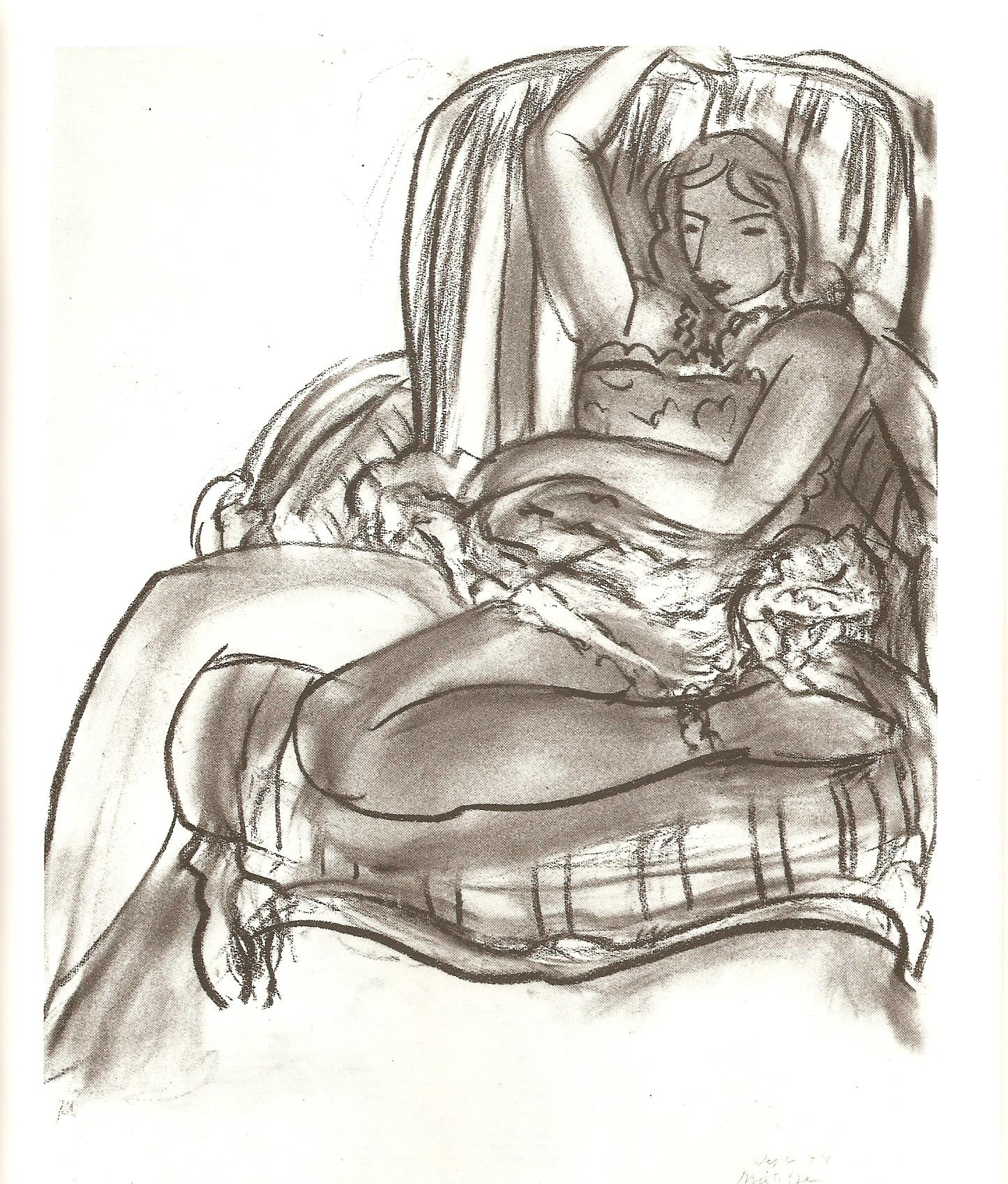
Henri Matisse. Ballerina Seated in an Armchair, 1944

It is Henri Matisse’s most controversial saying. “What I dream of is an art of balance, of purity and serenity, devoid of troubling or depressing subject-matter, an art which could be for every mental worker, for the businessman as well as the man of letters, for example, a soothing, calming influence on the mind, something like a good armchair which provides relaxation from physical fatigue.” Critics pounce on this quote, arguing that Matisse’s concern for beauty leads to comfort on the part of the viewer, indulgence, complacency. It is no way to change the world. But let’s be fair to Matisse. The artist took up art relatively late in life–at the age of 20–while recovering from an operation. Art was a form of therapy. The armchair simile may be Matisse’s way of saying that art has healing or restorative properties. Restful as the chair may be, in the charcoal drawing above, the ballerina in it seems to dancing. She is at once at rest and in motion, limp but graceful. As a dancer, she is also an artist, so Matisse may be commenting on his own process. Art involves both activity and its opposite.

How else is art like an armchair? Art needs a viewer–an armchair with a body in it. Art makes us stop and comtemplate. Art takes time–it takes time to make, it takes time to digest, to sink in. At some point, the viewer engages with the work and changes the work.

Max Ernst. collage, La Femme 100 Tetes, 1929

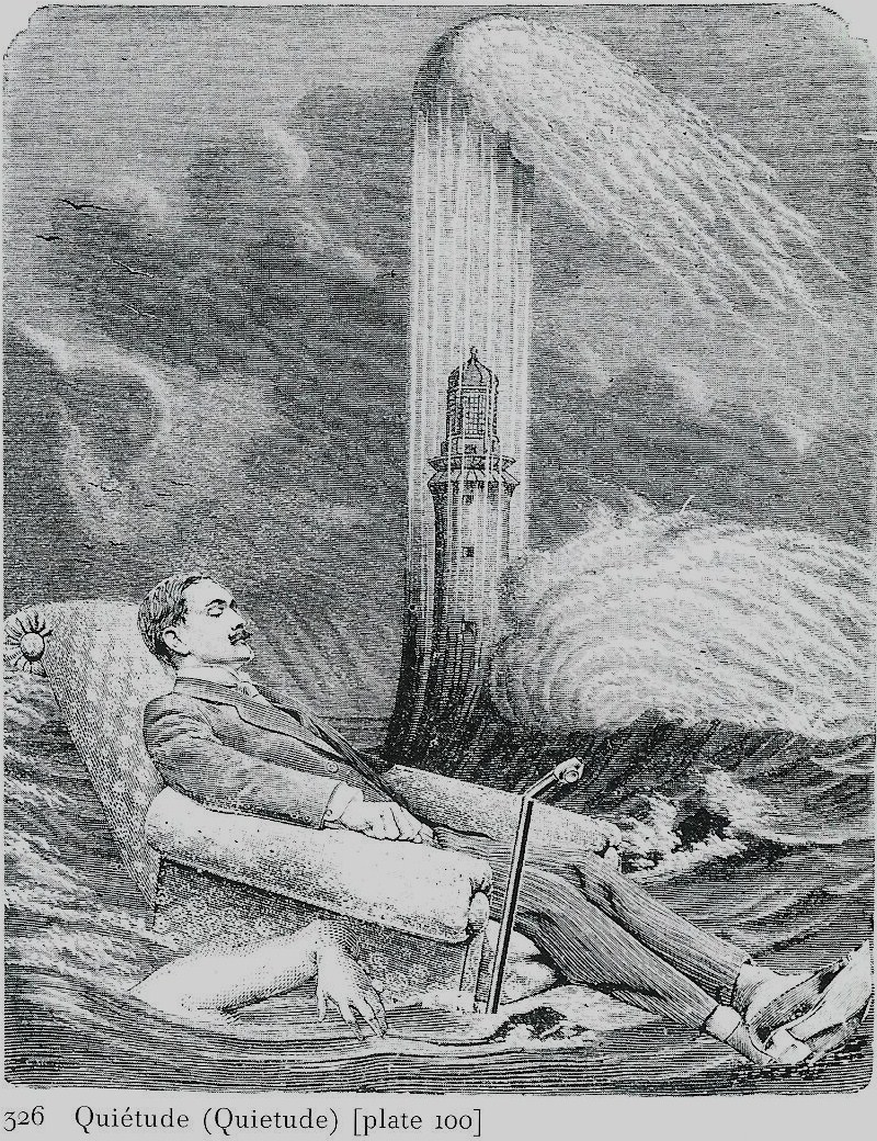
In a collage for Max Ernst’s collage-novel, La Femme 100 Tetes, 1929, a man falls asleep in an armchair and dreams of phallic shooting jets and flooding waters. He is the respectable bourgeois man whose unconscious reveals unspeakable desires, chaos, fears.

Other artists use chairs to challenge our understanding of media. Robert Rauschenberg is an artist famous for merging large three-dimensional objects with flat canvases in a way that blends painting and scultpure. In one work, Pilgrim, 1960, a paint-splattered chair sits beside a paint-splattered canvas. Conceptual artist Joseph Kosuth does something similar by placing a real chair beside a photograph of a chair and a dictionary definition of a chair. Chairs are at home in surrealist art, abstract expressionist art, conceptual art. They take on meanings that range from bourgeois to anti-bourgeois. They are even political.

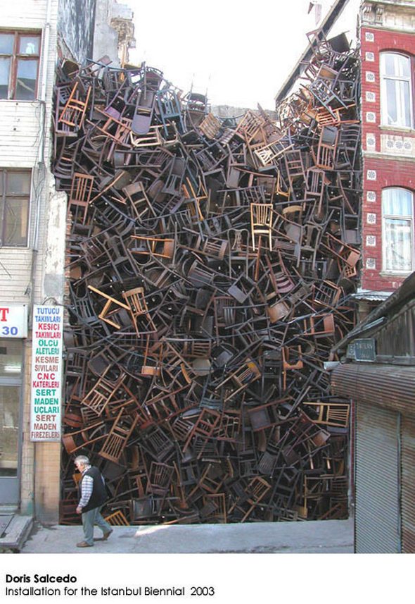
Doris Salcedo. Installation for the Istanbul Biennial, 2003

Colombian artist Doris Salcedo makes artwork using chairs she collects from the families of the victims of state violence. These victims have been abducted and made to disappear from the political scene. Salcedo displays their chairs as symbols of voices that have been silenced. In the installation at right, the chairs are stacked in an urban crevice like bodies in a mass grave. In other works, Salcedo encases chairs, writing desks and other pieces of furniture in blocks of cement. They function like repressed memories; vanished people whose presence continues to haunt us.

Dawn MacNutt. Man in a Black Coat


Dawn MacNutt is a Canadian artist who merges craft and fine art sculpture. Her Man in a Black Coat, 1985, made of woven rope and willow, creates a fusion of half-man, half-chair. Here we feel the identity of a ghost-like being struggling to come to life. MacNutt depicts a world of flux and metamorphosis,    embracing human frailty in her frequently bowed and hollow figures and in her use of discarded materials like ditch-growing weeds and cast-off rope.

Art is like an armchair. Matisse’s simile takes us from the notion of comfort and luxury to that of therapy, self-healing and contemplation. The simile suggests the role of the viewer in completing a work of art. It evokes dreaming and the unconscious, expanding traditional media into realms of multimedia and conceptual art. It marks the place and memory of missing persons and serves as a lingering political protest. It also merges boundaries of art and non-art, where the possibility of transformation and the energy of imagination engage in a productive interaction.


Posted in Uncategorized | Tagged

Armchair Collage

Ed McKean. Artist's Studio, 2012. Collage and oil paint on paper

I cut an image of an armchair from a magazine and placed it on top of paint-smeared scraps of paper used to clean my brushes. The result: a portrait of my studio.

Posted in Uncategorized | Tagged

Smile Collage

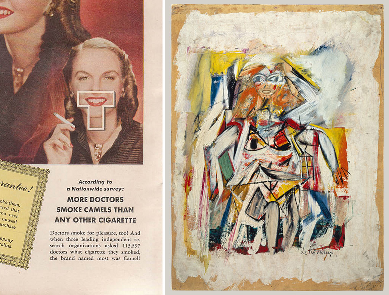
deKooning collages the mouth from this Camel cigarette ad to his 1950 painting Woman.

While researching artists who use collage, I was intrigued to see how American Abstract Expressionist Willem deKooning incorporated elements from ads into his paintings. The addition of a mass-reproduced smile (from a rather grotesque cigarette ad) makes the face in the painting above a little more mask-like. The intrusion of a foreign element complicates the charming spontaneity of the figure, as realism and abstraction collide in a jarring hybrid image.

I challenged myself to make my own smile collage. This is what I came up with.

Ed McKean. Smile, 2012


Could an abstract construction be a face? A mask? Or are the colours and forms just happy to be together? Hope this collage makes you smile.


Posted in Uncategorized | Tagged

5 Theories of Advertising

Advertising is the great evil, the great annoyance, the less-than-truthful spin of which everyone despairs. Yet adversing may serve as the very foundation of modern media as revenue from ads finance our newspapers, radio, television, Internet and social media. In this blog, I look at 5 theories applied to advertising and consider how the different approaches intersect.

Kellogg’s Corn Flakes Psychologist Personality (1967)

1. The hidden message. The idea that ads mislead and unconsciously manipulate the viewer was advanced by sociologist Vance Packard in his 1957 best-seller, The Hidden Persuaders. Packard argued that advertising is dangerous because it uses psychology to create emotionally-loaded hidden messages. Because the message is hidden, the viewer’s critical resistance is evaded and minimized.

The Cornflakes ad at left suggests this product promotes not just good physical health, but also good mental health. It is a classic instance of “a doctor uses this product, it must be healthy” approach. It also demonstrates how psycho-analysis has entered the mainstream and become something of a joke. The joke is that we are all split personalities, wavering between lazy hedonism and disciplined self-improvement. Happily, cornflakes serve both interests: they are a candy-like treat and they are also a form of breakfast.

2. Shifting loyalties. Ads play upon and reflect conflicted, ever-changing loyalties. While ads try to cultivate a strong sense of brand loyalty, ads also urge consumers to change loyalties, to try something new, to disavow an old loyalty in favour of a new product.

In her study,  Advertising in the 60s, (Praeger, 2001), media historian Hazel W. Warlaumont argues that ads changed from the 1950s to the 60s. The look and message of many ads appeared to embrace the anti-authoritarian hippie counter-culture, all the while being designed and distributed by giant corporations promoting the status quo and capitalist interests. Warlaumont argues that advertisers co-opted the anti-establishment’s “ideals, leaders, icons and goals into the existing structure.” (p. 138)

Not only does the revolutionary socialist Che Guevara appear on T-shirts, but the commercial success of this icon leads to imitations and parodies such as the Cher Guevara shirt on right.

Warlaumont’s argument inverts the concept of détournement, developed by activist Guy Debord and others in the 1960s. Debord was leader of the radical collective, Situationist International and author of The Society of the Spectacle, 1967. Détournement refers to an artist’s reuse of familiar images, by shifting contexts to create a new work with a different often contrary message. Détournement has an element of ‘anti-art’ using blatant theft and sabotage of existing elements, turning the original message against itself. The idea leads to the later strategy of culture jamming. Both strategies are conceived as a method of resistance to the grosser elements of Capitalist culture and raise awareness of corporate ploys and their social effects.

An example of an ad using elements of détournement is the print ad below sponsored by the World Wildlife Federation. The “turned” element here is the portrayal of a toxic industrial can as both a kind of giant urban monument and as the polluted life water of the city. The image redirects the pride we might take in the magnitude of our industrial complexes into a fear that we are poisoning the very environments that are essential to our existence.

wwf.Advertising AgencyContrapunto, Madrid.2007
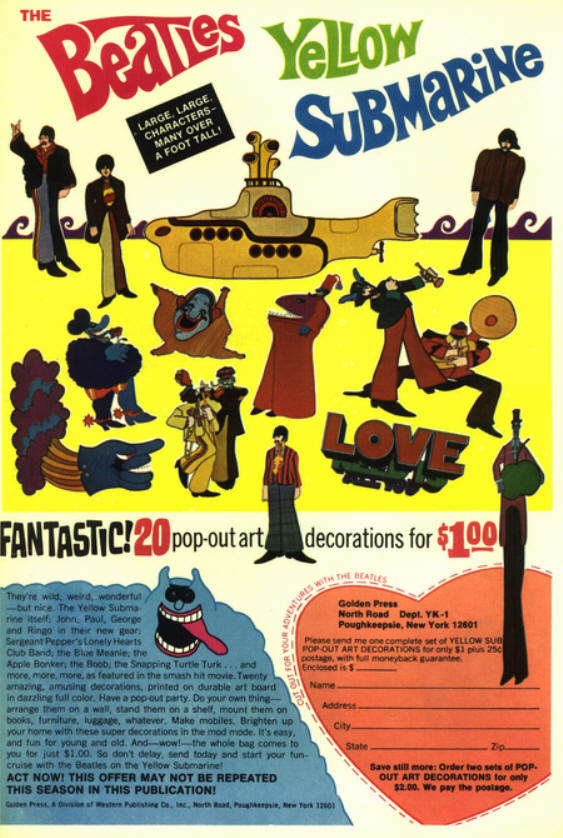
The Beatles’ Yellow Submarine, 1968 animated film by Canadian animator George Dunning.

Changing the intent of public messages is a two-way street however, practiced by advertisers just as readily as by activists and artists. Détournement gives way to recuperation. Originally subversive works and ideas are themselves appropriated by mainstream media. The philosopher Gilles Deleuze speaks of deterritorialization and reterritorialization to describe this ongoing war of counter-ideologies.

These image wars reflect shifts in loyalties and conflicted loyalties. For instance, the Beatles were leaders of the 60s counterculture, with their experiments with drugs, their personal song lyrics, anti-war attitudes and openness to Eastern philosophy and religion. However the Beatles also invented the music video and pioneered the use of cross-branding music, films and related products, as the ad above demonstrates.

Playing on her own image, Paris Hilton features in a series of Guess ads in 2009

3. The mediation of reality. Ads only work in conjunction with other media and environments in which they are embedded and cannot be understood apart from other media and environemnts. Marshal McLuhan noted that it is not the content of ads that makes them so persuasive. Rather it is the way they use media to fuse together a world of actions and a world of fictions. McLuhan writes: “When the movies came, the entire pattern of American life went on the screen as a non-stop ad. Whatever any actor or actress wore or used or ate was such an ad as had never been dreamed of … The result was that all ads in magazines and the press had to look like scenes from movies.” (Understanding Media, 1964, p. 252) InThe Image: A Guide to Pseudo-events in America, 1962, historian Daniel J. Boorstin describes how news and advertising have blended together to such an extent in popular media that they create an impression in which truthful reporting becomes ambiguous and the difference between a serious newsworthy event and a fabricated news event, such as a publicity stunt, is indistinguishable. But Boorstin does more than just describe how ads disguise themselves as news. He sketches the origins of celebrity culture, as fame and overblown public exposure become coveted ideals not just among a small set of people but among the general population of image and media consumers. However the ability to generate publicity and controversy, to saturate and bombard, to get people noticing, talking, arguing is something products do as well as people. We have celebrity brands. Advertising thrives in a celebrity culture and is integral part of it.

In the ad for Guess shown above, Paris Hilton steps off a helicopter accompanied by a male lover/ servant rolled into one. She exudes an air of wealth and glamour, playing her private life out in the public eye as heiress, model and reality TV star. The ad looks like a paparazzi photo, blurring boundaries between reality and fantasy.

McLuhan explains our addiction to media by pointing out that media extends and heightens sensory responses. For example, why do we like to read press stories of events we’ve already witnessed? McLuhan answers: “The press repeats the excitement we have in using our wits, and by using our wits we can translate the outer world into the fabric of our own beings. This excitement of translation explains why people quite naturally wish to use their senses all the time. Those external extensions of sense and faculty that we call media we use as constantly as we do our eyes and ears, and from the same motives. On the other hand, the book-oriented man considers the non-stop use of media debased; it is unfamiliar to him in the book-world.” (p. 229) Media adds an extra level of mediated experience to things we already know, giving to reality a sense of hyper-reality. Ads thrive in this land of extra-mediated hyper-reality.
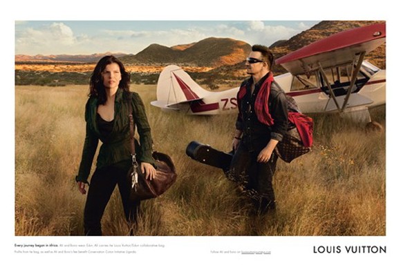
Rock stars save the planet in this Louis Vuitton ad, 2010, photo by Annie Leibovitz.

4. The magic of meaning. Ads don’t just sell products but infuse those products with meaning for the people who use them. In this way, ads influence our values and underlying beliefs. Carlyle put it rather bluntly in the 19th century: “The quack has become God.” In his seminal essay, ‘The Magic System‘ (1962), cultural theorist Raymong Williams argues that advertising “has passed the frontier of the selling of goods and services and has become involved with the teaching of social and personal values; it is also rapidly entering the world of politics. Advertising is also, in a sense, the official art of modern capitalist society: it is what ‘we’ put up in ‘our’ streets … and it commands the services of perhaps the largest organized body of writers and artists, with their attendant managers and advisers, in the whole society.” Williams goes on to remark that as a form of organized magic, advertising obscures the true nature of consumerism and its effects on public attitudes and social goals. Keeping the public away from discontented questions, advertising “is a true part of the culture of a confused society.”

The above ad uses many of the same features as the Paris Hilton ad for Guess, but the message is the opposite. The party girl in the helicopter was looking for adventure and excitement, indulging her own whims and revelling in the exposure and notoriety this indulgence brings to her. In the above ad, the celebrity rock star Bono and his wife Ali Hewson descend from the sky like angels into a pristine African wilderness, which their activities will be protecting. Bono uses corporate sponsor Louis Vuitton, working together with his own company Edun, to produce hand-bags made in Africa. Proceeds from sales are reinvested in the local economy. The ad functions as a fundraiser, but also suggests Bono and wife have come to Africa for other reasons. Returning to the roots of humankind for inspiration, it is the ultimate trip. The ad plays on ideas of youth, travel and self-discovery, mixed in with an altruistic concern for other people and other places.

James Twitchell, author of Adcult USA: The Triumph of Advertising in American Culture, 1996, writes: “Mid-twentieth-century American culture is often criticized for being too materialistic…we are not too materialistic. We are not materialistic enough. If we craved objects and knew what they meant, there would be no need to add meaning through advertising … What is clear is that most things in and of themselves do not mean enough. In fact, what we crave may not be objects at all but their meaning. For whatever else advertising does, one thing is certain: by adding value to material, by adding meaning to objects, by branding things, advertising performs a role historically associated with religion.” (p. 12)
The essential message of all ads.

5. Imitative desire. Ads play upon people’s tendency to desire what others desire. French theorist René Girard argued that we often desire to become the other (when the other is powerful, famous or beautiful). However it is impossible to become another person. This impossibility keeps our desire alive. Girard’s ideas are explained in depth in Kathleen M. Vandenberg’s
“Sociological Propaganda”.  Vandenberg argues that ads function as interactive rituals rather than as one-way messages. The essence of a ritual is that people place themselves in communities through imaginative projection toward others.

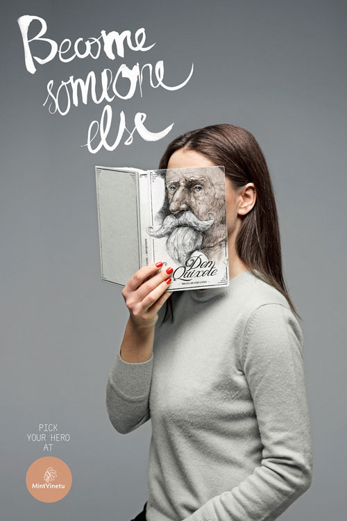
The ad for a bookstore above, suggests that books function as escapes from ourselves as we take on the disguises of others, stepping into imaginary worlds. Ads serve a similar function. We see a product. Someone in the ad wants the product. We want the product because it is desired by others. This is René Girard’s idea that our desires are always mediated. Ads cannot affect us unless we participate in the social ritual, the imitative act, that they invite us to.

Conclusion

I have outlined 5 ideas concerning advertising. It is remarkable how these ideas appeared within ten years of one another, the span from sociologist Vince Packard’s The Hidden Persuaders in 1957 to Guy Debord’s The Society of the Spectacle, 1967. Each viewpoint acknowledges that ads reflect, but also distort certain aspects of our lives. Commentators such as Packard and Barthes argue that ads need to be critiqued to reveal hidden messages, hidden ideologies. Raymond Williams suggests that ads are an effective form of propaganda because they play on our patterns of social bonding and our loyalty to symbols. Winning this loyalty involves the shaping of opinions and beliefs. Kathleen M. Vandenberg notes how advertising “exhibits many of the characteristics of propaganda; chief among these characteristics is a speaker’s reliance on self-interest (rather than the good of the audience), anonymity (or the suppression of ethos), the use of saturation or repetition of messages (rather than the delivery of formal speeches), and the employment of emotional appeals (rather than logical ones). Advertising meets these criteria insofar as it is, in the words of Twitchell, “ubiquitous, anonymous, syncretic, symbiotic, profane, and, especially, magical.

Historian Daniel Boorstin, author of The Image: A Guide to the Pseudo-event in America, 1962, suggests that the critique of ads leads to controversy, the key ingredient of celebrity culture. Critique does nothing to demystify a product, rather just the opposite. Debord suggests that in an ideological war all the rules of rational debate go out the window. If you want to oppose the message of an ad or the corporate aims which it promotes, then you must counter-attack, manipulating language, image and context to turn the message against itself. McLuhan’s approach to ads is to consider them an inseparable part of media and mass communication, part of an on-going technological revolution. Like every other message, ads obey the four laws of media. Applying McLuhan’s laws to ads, one could say: ads enhance our senses, ads make other types of messages obsolete, ads retrieve overlooked areas of culture from the past, ads lead to unexpected side effects which trigger reversals opposing the original initiative. Turning from technology to religion, Girard suggests we should not speak of reforming ads, as much as of reforming ourselves. Humans are great imitators and mimics, in need of a sense of belonging and a sense of meaning. But when we try to fill our deepest needs by imitation alone, we get in trouble.

I personally believe that all of the above positions have merit. The purpose of a critique is not to combat evils, but to enhance understanding and clarify values, to lessen the distance between what we’re doing and what we’d like to do. For those who prefer taking more direct actions, Debord’s strategy of détournement may be more useful. It recognizes advertising is an infinitely adaptable tool that can serve the revolution as well as the corporation. McLuhan helpfully reminds us not to focus exclusively on messages, but to also study the media and environments in which messages are conveyed. We need to keep reinventing media and reconfiguring our social networks. McLuhan believed electronic and digital media were making culture more participatory and interactive. However the more we interact, the more we tend to imitate others. This is why I conclude on Girard’s notion that we need to take responsibility for our acts of imitation.


Language Lessons


NV on her new film, Language Lessons.

Remix, collage, mash-up. Retelling stories. People love stories to the point where they do something terrible to stories. They turn them into products. Commercial stories tend to be glossy and predictable, which to my mind is the opposite of what a story is. A story should be a little messy, and keep changing, growing, surprising.

I found the birth footage in an anthropological film. I thought what if this were framed in a different way? What if we saw this birth not as social studies, but as science fiction? That’s why I show it as a film within a film, following footage from Tarkovsky’s Solaris.

A language lesson from Michel Thomas is used throughout the film. To me, language is the ultimate mash-up. I love Michel Thomas’s approach. His tapes aren’t language drills so much as seductions and hypnotisms. You listen to foreign sounds and you absorb without even realizing it. Looking at art is a lot like learning a foreign language. You feel on the outside of something bewildering, something that communicates but the only way to get it is through habit and immersion.

There’s something absurd about the way the voice-over of the language lesson interacts with the images. It’s the loneliness of technology. I tried to imagine what if a person listening to a language lesson over and over began to fixate on the voice as if it were speaking to her personally, as if it were giving her advice on how to live her life. Magical thinking. William Gibson calls it apophenia or faulty pattern recognition.

The film was partly inspired by Gibson’s novel Pattern Recognition. The challenge I set myself is to try to merge drama, documentary and animation footage. To see them not as separate fields, but as interacting forces. Drama, believability, imagination.


Posted in Uncategorized