Romance, surrender, rescue. The girl in the boy’s arms. The girl in the robot’s arms or the monster’s fist. Screaming, swooning, terror, ecstasy. The very stuff of movies, harlequin novels, trashy drama. Guilty pleasures.
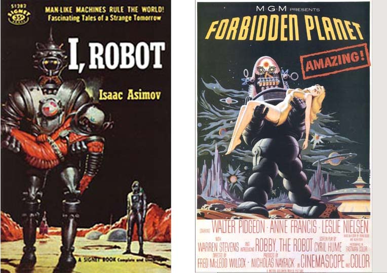
Why is the Asimov cover image (seen above) uninspiring, whereas The Forbidden Planet poster is fun, saucy and weird? The tilted perspective, the grinning face, the bathing beauty–is she an astronaut or an extra from a Tarzan movie who walked onto the wrong set? No pretence at realism here. Enter loveable Robbie the Robot, stick in a Chinese pagoda, fainting women, Grand Canyon rock forms, and it is, as advertised, amazing. The movie sadly does not live up–how could it?
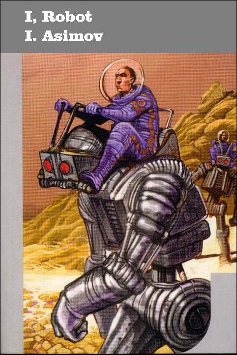
Compare this delightful cover illustration by E. Gorinstein from the 2002 J’ai Lu edition of Les robots (I added the English title pun). Here we see robot not as alien monster but rather robot as funky car. Its eyes serve as headlights, antenna as steering wheel/ gear shift, chin plate as pedal. The astronaut looks bored for a space cowboy, which adds to the humour. This is not an astonishing adventure but something he does every day. Like operating a backhoe. The purple Ziggy Stardust spacesuit adds a note of style. The illustration depicts one of the early stories in Asimov’s vision of human-robotic symbiosis and delightfully conveys Isaac Asimov’s humour of robot psychology.
Illustrator Richard Powers
The most versatile and experimental of science fiction illustrators. A complete illustrated list of his book covers can be found on the invaluable site, Internet Speculative Fiction Database. Early work owes a debt to surrealism. Later work makes use of paint splatter and collage. This 1953 cover illustrates Clarke’s story The Sentinal, the starting point for the film 2001: A Space Odyssey. A monolith, depicted as an irregular undulating pyramid, is shown on the surface of the moon with the Earth in the distance beyond. The monolith raises the question: is it a natural form or a manufactured object? An ant-sized human figure throwing a giant shadow appears on the horizon under a hovering blimp-like eye.
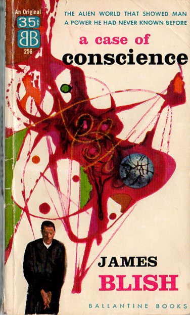
Here is another cover by Richard Powers. In the story, missionaries and scientists establish a colony on a remote planet with few natural resources valuable to humans, except for a substance used in the making of nuclear bombs. The colonists debate whether they should reveal the truth to other humans or suppress it.
Abstract expressionism, atomic structures in a novel obsessed with Cold War posturing. Both an anthropological approach to SF, and a religious fable, James Blish’s A Case of Conscience is cited by Orson Scott Card as a strong influence for his novel Speaker for the Dead.
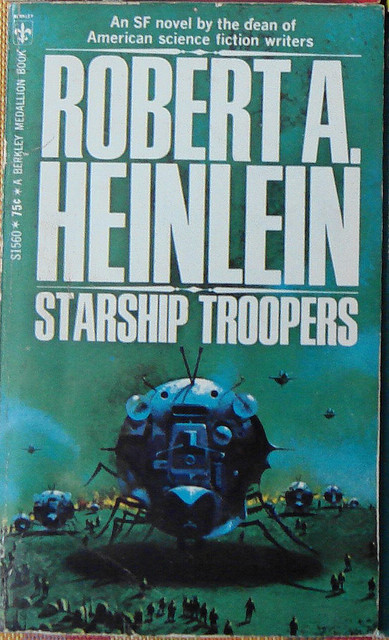
Cover art Paul Lehr
The insect-like space craft with its dark cavernous shadow, monumental in scale next to the uneven line of waiting figures, produces a bizarre effect, as in the paintings of Hieronymous Bosch. We ask what is it, in this confrontation with the unknown. The green sky with blue clouds suggests an alien atmosphere. The yellow fire on the horizon is all that distinguishes sky from ground. The luminance of the wash, the hard sheen of metal, the contrast of scale, all give this design a graphic punch that matches the drive and gusto of Heinlein’s writing.
Illustrator Bob Pepper
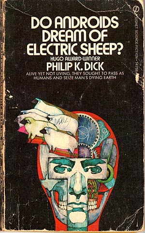
Just how do you illustrate a Philip K. Dick novel anyway? Using a Pop Art approach, as in this illustration by Bob Pepper, is not a bad idea. Pop Art is linked to the mass consumption of a consumer society. Pop Art is often produced using similar methods of mass reproduction like Andy Warhol’s silkscreen prints. Other artists mix Pop icons with Op Art, using bright colours, bold semi-abstract patterns suggesting psychedelic material or attitudes of mind, as well as an ecclectic sensibility that is as open to comic books as it is to Eastern mysticism. In this illustration, Pepper shows the mask-like features of a face barely covering a skeleton and robotic gears, from which seem to pour a parade of clone-like sheep. It immediately makes one think: does a robot have a mind and if so how human is that mind? What exactly are we looking at here? Man or machine? This is the very ambiguity that underlines Dick’s novel.
Remember a time when people got pleasure just looking at an album cover? More on artist Bob Pepper can be found here.
Popular movies, books and art share ideas and strategies for conveying other worlds. Experiments with visual styles, such as surrealism and Pop Art, unite books of the future with the period in which they were created. The references to Fine Art push a once-marginal genre to new levels of respectability. Pulp art is fun, pushing proprieties of tastefulness. Modern art is innovative, pushing boundaries of aesthetic experience. Science fiction cover art draws on both, adopting visually daring designs to match the unconventional ideas found inside the covers.
